our
Logo

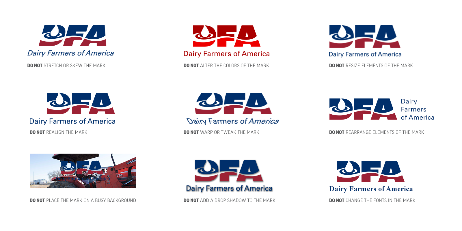
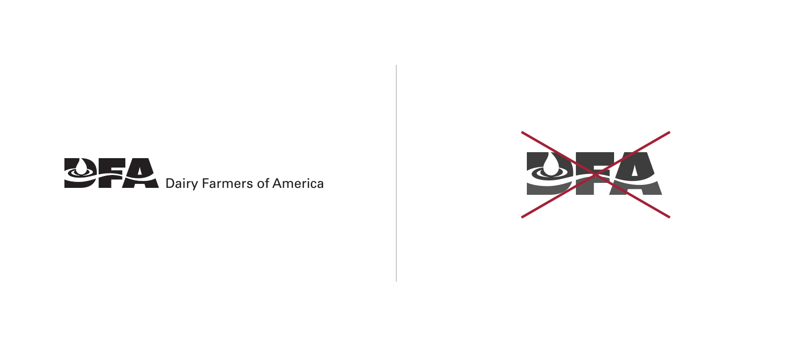
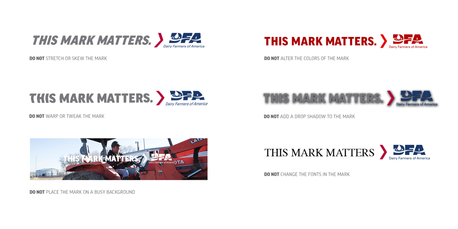
Our mark, widely known as our logo, is not just used to designate our buildings or top our letterhead. It’s a symbol that represents everything that matters to us, from our employees and members to the innovative products and partnerships that make up Dairy Farmers of America.

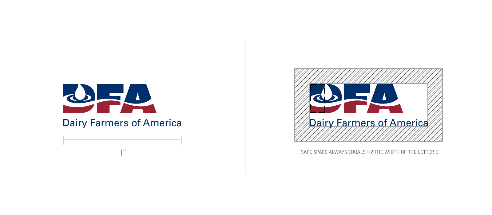
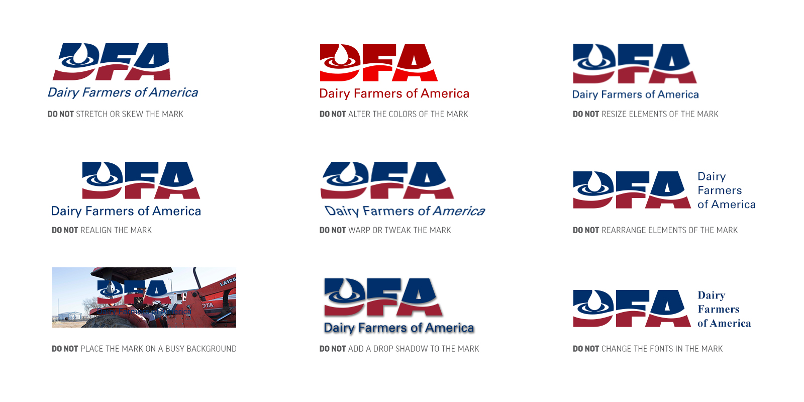
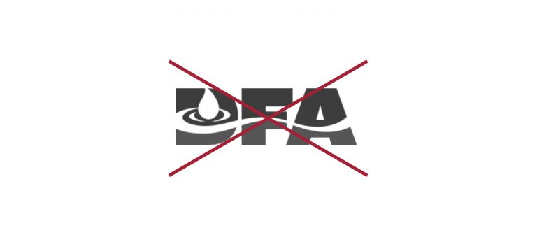
For these reasons, we must treat our entire suite of logos with great care. That means using the right mark with the right message at the right time. Below are tools to ensure proper usage and placement for a variety of brand communications.

Our primary logo features our acronym (DFA), left aligned with smaller text beneath reading ‘Dairy Farmers of America’. Four versions of this mark are available for use, but the two-color option is the preferred mark for primary use.

The all-white version of our mark is available for use when printing options are limited or the background does not provide enough contrast for the two-color mark. This mark should only appear on backgrounds that provide contrast and legibility as shown above.

The all-black version of our primary mark is available for use when color printing is unavailable. 

The usage of our one-color, American Navy version of our mark should be carefully considered. To date, this version has been reserved for digital executions and embroidery. For questions regarding usage of the one-color, American Navy version, please contact the Communications team.

Working files of this mark for use in print applications (CMYK & Pantone Matching System) as well as digital and web applications (RGB) are available on the DFA Asset Library.

Minimum Size

Safe Space

The minimum logo size for all DFA marks is one inch wide. This rule protects the legibility and recognizability of our mark.


The DFA logo should always include a “safe space” surrounding the mark in any layout. This area ensures legibility of the brand on our communications. As a rule, the minimum amount of safe space should measure half the width of the letter ‘D’ in the logo as shown above.

No other images or graphic elements should interfere with this safe space.

All working logo files that appear in our DFA Asset Library include the safe space as the background size.

Incorrect Usage

Examples

The primary logos should never be altered, recreated or re-proportioned (stretched) in any way. This includes placing our mark on backgrounds that hinder legibility or distort perception of the DFA brand.

Below are some examples of incorrect uses of the logo. If you have questions regarding proper logo usage, please contact the Communications team.

Removing the Word Mark

As DFA works to expand our reputation and increase awareness, our audiences need to be able to identify our brand. Removing the words ‘Dairy Farmers of America’ from the primary or secondary marks is not permitted. 

Whenever possible, place the left justified logo on the left side of any layout. This will enhance the justification and either start or complete the layout with our logo.

With the exception of banners and signs, logos should never take up more than 20 percent of the space on a layout.

Center Aligned

Our center aligned logo features our acronym (DFA) in a two-color split, with smaller text beneath reading ‘Dairy Farmers of America’. Two versions of this mark are available for use, but the two-color option is the preferred mark for primary use. The all-white version of our mark is available for use when printing options are limited or the background does not provide enough contrast for the two-color mark.

The all-white version should only appear on backgrounds that provide contrast and legibility as shown above.

OurLogo_Primary_MinimumSizes_SafeSpace

Minimum Size

Safe Space

The minimum logo size for all DFA marks is one inch wide. This rule protects the legibility and recognizability of our mark.

The DFA logo should always include a “safe space” surrounding the mark in any layout. This area ensures legibility of the brand on our communications. As a rule, the minimum amount of safe space should measure half the width of the letter ‘D’ in the logo as shown above.

No other images or graphic elements should interfere with this safe space.

All working logo files that appear in our DFA Asset Library include the safe space as the background size.

Incorrect Usage

Examples

The primary logos should never be altered, recreated or re-proportioned (stretched) in any way. This includes placing our mark on backgrounds that hinder legibility or distort perception of the DFA brand.

Below are some examples of incorrect uses of the logo. If you have questions regarding proper logo usage, please contact the communications team.

Exceptions

Removing the wordmark

This mark has a one-line alternate that is specifically for apparel and promotional items. To utilize this mark, please contact the communications department.

As DFA works to expand our reputation and increase awareness, our audiences need to be able to identify our brand.  While it may be considered in the future, removing the words ‘Dairy Farmers of America’ from the primary or secondary marks is not permitted. 

Lorem ipsum dolor sit amet, consectetur adipiscing elit, sed do eiusmod tempor incididunt ut labore et dolore magna aliqua. Dignissim convallis aenean et tortor at risus. Ultricies tristique nulla aliquet enim tortor at auctor urna nunc. Imperdiet proin fermentum leo vel orci porta non pulvinar.

Lorem ipsum dolor sit amet, consectetur adipiscing elit, sed do eiusmod tempor incididunt ut labore et dolore magna aliqua. Dignissim convallis aenean et tortor at risus. Ultricies tristique nulla aliquet enim tortor at auctor urna nunc. Imperdiet proin fermentum leo vel orci porta non pulvinar.

Secondary Logo

DFA_Inline_Right_RGB

Our secondary logo features the words ‘This Mark Matters’ in 65% grey paired with a Barn Red chevron pointing right toward our logo in a one-color, American Navy treatment.

While one-color versions of this mark are available for use, the three-color option is the preferred secondary logo. The all-white version of the secondary mark is available when printing options are limited or the background does not provide enough contrast for the three-color mark. The all-white mark should only appear on backgrounds that provide contrast and legibility as shown above.

Horizontal and stacked versions of this mark are also available for use. The horizontal or in-line option is preferred though the stacked version is available for placement where horizontal space is limited. Both stacked and in-line versions (in three-color and all-white) of these lockups are available in the DFA Asset Library.

TMM_Min_Sizes

The minimum logo size for our secondary mark utilizes the rule for our primary logo. To ensure that legibility is maintained, ensure that our primary logo is at least one inch wide even in this secondary lockup. To do so, the entirety of the secondary lockup should be 4″ wide.

As with the primary mark, the secondary logo should always include a “safe space” surrounding the mark. Due to the complexity of the secondary mark, the surrounding space is increased. As a rule, the minimum amount of safe space should measure the height of the chevron in the mark, as shown.

No other images or graphic elements should interfere with this safe space.

The secondary logos should never be altered, recreated or re-proportioned (stretched) in any way. This includes placing this mark on backgrounds that hinder legibility or distort perception of the DFA brand.

Below are some examples of incorrect uses of the logo. If you have questions regarding proper logo usage, please contact the Communications team.

Our primary logo is how we identify our brand while our secondary logo is how we identify our purpose. As we identify and share why ‘This Mark Matters’ in our communications, the secondary mark should punctuate these proof points and examples. By doing so, our audiences will continue to connect the primary logo to the reasons it matters.

As always, if you have questions regarding how or when to use the DFA logos, please contact the Communications team.

Here is a checklist to use when considering the secondary logo:

  • Does this communication convey why our mark matters?
  • Does this provide proof to our audiences that our mark matters?
  • Does the content mention our purpose in relation to our offering?
  • Does the inclusion of the secondary logo add clarity to that purpose?
]

TMM1SL

Our secondary logo features the words ‘This Mark Matters’ in 65% gray paired with a Barn Red chevron pointing right toward our logo in a one-color, American Navy treatment.

While one-color versions of this mark are available for use, the three-color option is the preferred secondary logo. The all-white version of the secondary mark is available when printing options are limited or the background does not provide enough contrast for the three-color mark. The all-white mark should only appear on backgrounds that provide contrast and legibility as shown above.

Horizontal and stacked versions of this mark are also available for use. The horizontal or in-line option is preferred though the stacked version is available for placement where horizontal space is limited. Both stacked and in-line versions (in three-color and all-white) of these lockups are available in the DFA Asset Library.

OurLogo_Secondary_STACKED_MinimumSizes_SafeSpace_1525x667

The minimum logo size for our secondary mark utilizes the rule for our primary logo. To ensure that legibility is maintained, ensure that our primary logo is at least one inch wide even in this secondary lockup. 

As with the primary mark, the secondary logo should always include a “safe space” surrounding the mark. Due to the complexity of the secondary mark, the surrounding space is increased. As a rule, the minimum amount of safe space should measure the height of the chevron in the mark, as shown.

No other images or graphic elements should interfere with this safe space.

The secondary logos should never be altered, recreated or re-proportioned (stretched) in any way. This includes placing this mark on backgrounds that hinder legibility or distort perception of the DFA brand.

Below are some examples of incorrect uses of the logo. If you have questions regarding proper logo usage, please contact the Communications team.

01_OurLogo_Secondary_SUPPORTGRAPHICS_v2_R2_IncorrectUsage_Stackedd_1309x694

Our primary logo is how we identify our brand while our secondary logo is how we identify our purpose. As we identify and share why ‘This Mark Matters’ in our communications, the secondary mark should punctuate these proof points and examples. By doing so, our audiences will continue to connect the primary logo to the reasons it matters.

As always, if you have questions regarding how or when to use the DFA logos, please contact the Communications team.

Here is a checklist to use when considering the secondary logo:

  • Does this communication convey why our mark matters?
  • Does this provide proof to our audiences that our mark matters?
  • Does the content mention our purpose in relation to our offering?
  • Does the inclusion of the secondary logo add clarity to that purpose?

© 2025 Dairy Farmers of America, Inc.  Privacy Policy | Terms of Use | California Supply Chains Act