OUR BRAND
ELEMENTS

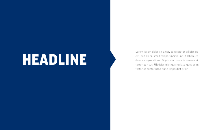
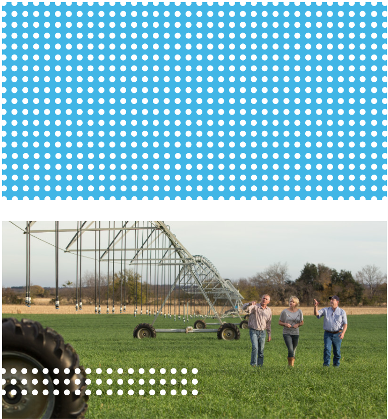
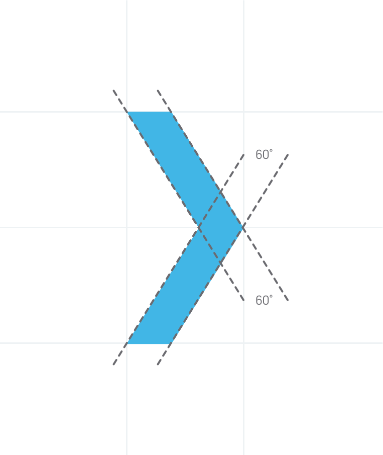
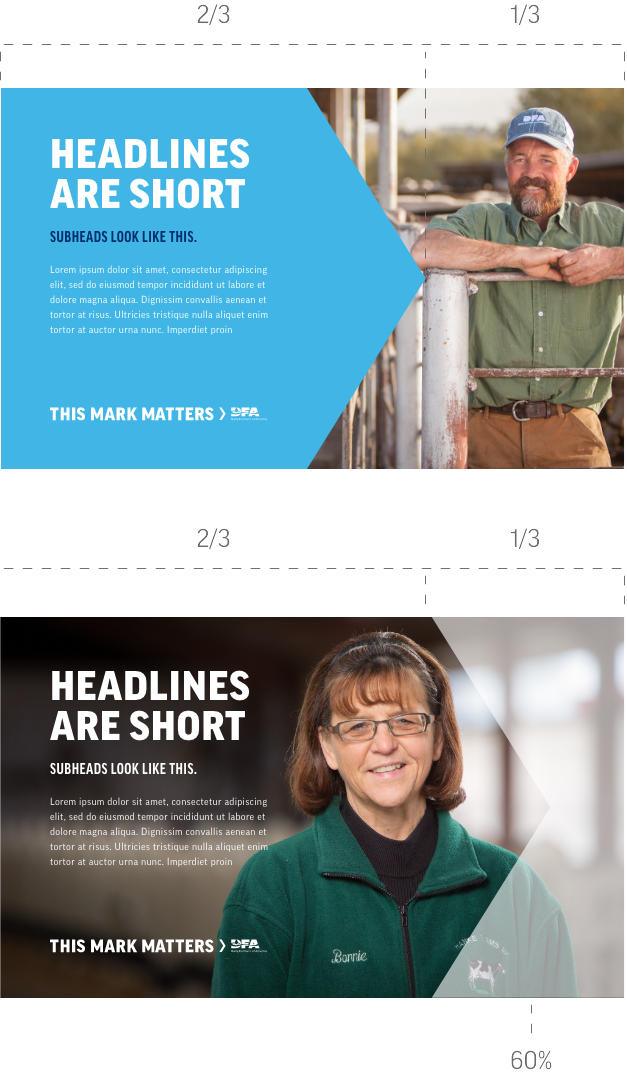
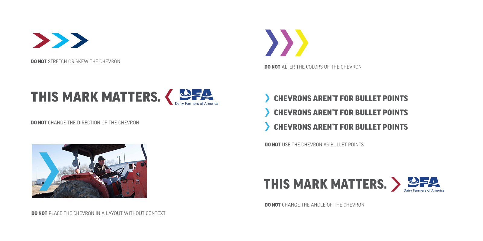
The DFA brand is an ecosystem characterized by dedicated support, visionary innovation and active engagement. Our visual toolkit is made up of many elements that contribute to a unique experience that supports the tone of our brand. When used consistently, these elements create a kinetic and unified look that allows our audiences to identify, and connect with, our communications.

The Chevron

The Chevron was created as a visual element that symbolizes the forward progress that DFA is making for our farmers, our employees and our industry. It is the cornerstone of our visual system and should be treated with great care so as not to be overused or misconstrued.

The chevron angle

The Chevron is carefully constructed to point forward at an angle that doesn’t feel overly aggressive or sharp. This 60° angle ensures a cantilevered icon that is balanced, consistent and strong.

The Chevron should always point to the right in all layouts and its angle, width or thickness should never be altered. The Chevron can point backwards only when it’s used as a UI element for an image carousel, allowing users to navigate to the previous image.

COLOR

To ensure proper contrast and consistency, the recommended Chevron treatments are as follows:

American Navy on Visionary Blue
Visionary Blue on American Navy
Visionary Blue on White
White on Visionary Blue
White on American Navy
American Navy on White

The Chevron in Barn Red is reserved for the This Mark Matters lockup and is not approved for usage in other scenarios.

Overlays

The Chevron can be used in horizontal layouts as a graphic overlay. The angle of the Chevron should never be altered to achieve this look. Graphic elements have been provided for use in the DFA Asset Library.

As a general rule, the chevron should occupy two-thirds of a layout when used as an opaque overlay.

When used as a transparent overlay, the chevron should only occupy one-third of the layout, allowing an image to be the focal point. The transparent overlay should always be white and the opacity set to 60%.

Incorrect Usage

Examples

The chevron should never be altered, recreated or re-proportioned (stretched) in any way. This includes placing the Chevron without context or in ways that may distort perception of the DFA brand.

Below are some examples of incorrect uses of the Chevron. If you have questions regarding proper Chevron usage, please contact the Communications team.

Arrows

Building on the graphic ideas behind the Chevron, our arrows offer our brand extended flexibility for both printed and digital applications. As with all of our brand elements, correct usage of these components enables DFA to be more easily recognized and should be used with care.

Using Arrows

The Chevron has been constructed to point forward at a 60° angle. To match this angle, our arrows have been created with the Chevron as the guide.

While the Chevron should always point to the right, our arrows have more flexibility and can point in both directions.

It’s important to never create this shape but rather download the asset from the DFA Asset Library.

Placement

The arrow can be used for a variety of situations but should be always utilized thoughtfully. Any treatment of the arrow should adhere to our primary color palette with the exception of Barn Red.

The arrows, pointing both left and right, can be a digital interface element that presents content as a carousel or other content off-screen that can be accessed.

The arrow can also be used to point to information directly tied to the content that precedes it. For example, the graphic at right shows the arrow pointing to content explaining the associated headline.

Incorrect Usage

Examples

The arrow should never be altered, recreated or re-proportioned (stretched) in any way. This includes placing our arrows on backgrounds that hinder legibility or distort perception of the DFA brand.

Below are some examples of incorrect uses of the arrow. If you have questions regarding proper arrow usage, please contact the Communications team.

DO NOT Alter the angle of the arrow

DO NOT Add elements to the arrow

Dots

Our dots are a subtle visual element that represent our members, our offices and our reach. They should never be the primary design element but rather be applied to a design as an accent that increases the visual balance of the layout. 

Color & Opacity

The dots should only appear in three colors: Visionary Blue, Subtle Silver and Milk White. The opacity should either be 100% or 60%.

The dots can appear on any background so long as they have visible contrast and do not add visual clutter to the layout.

Placement

The dots should always appear as a decorative element. They function best to balance a layout or to effect the overall hierarchy. Thoughtful placement of the dots is imperative.

Incorrect Usage

Examples

The dots should never be altered, recreated or re-proportioned (stretched) in any way. This includes placing dots on backgrounds that hinder legibility or distort perception of the DFA brand.

Below are some examples of incorrect uses of dots. If you have questions regarding proper dot usage, please contact the Communications team.

DO NOT Use more than 3 lines as an accent

DO NOT change the dots to unapproved colors

DO NOT Place the dots first in the hierarchy

DO NOT Make the dots to an outline

DO NOT Place the dots at an angle

DO NOT Place the dots over people or animals

Farmer IDs

DFA is a Cooperative made up of thousands of family farms and their passion is part of why our mark matters. This is why it’s important to add their images as well as their names to our work. By doing so, we ensure that our audiences understand that DFA is a collection of dedicated individuals working to bring dairy to their tables.

Typesetting & Color

Using the same treatment for all farmer IDs creates consistency. To do so, follow these simple rules:

  • Always use Title Case
  • Use “|” between info
  • Add two spaces before and after each “|”
  • Ideally set in 10 pt Good Pro Regular, but can increase/decrease in size as needed
  • Ideally listed in one-line, but can be broken into two lines or three lines as needed. In the case of three lines, no “|” is used
  • An ID tag is NOT needed if: no person is present (i.e. only cows or a barn are in the image) or the person’s face is not showing (either out of frame or it’s a side/back profile)
  • Due to responsive elements and legibility, Farmer IDs are not to be used on digital elements (i.e. website, apps, emails, etc.)
  • States should be included in AP Style, e.g. Kan. or Wis.

Placement

When placing this information in layout follow these guidelines:

Ideally, Farmer IDs should be placed in bottom right corner of image

IDs can be moved to other corners to increase legibility.

If Farmer IDs are needed for digital usage, it’s recommended to place them in the alt tag or in the footer as plain text (example: emails).

Color

Legibility is the rule of thumb for Farmer IDs. For this reason, they are typically set in White over photography for maximum visibility. Should the need arise for a color change on a Farmer ID, please consult the Communications Team for guidance and recommendations.

Members of Distinction

Farmer-owners who have received the coveted ‘Member of Distinction’ honor should only be recognized as such in their Farmer ID in communications during the Annual Meeting.


Plant Locations

For plant locations, our identification system becomes more simplified. When identifying these places follow this structure:
Plant Name | City, State

Example: DFA Cass City | Cass City, Mich.

Farm only

If the image shows a farm without showcasing a farmer-owner please follow this structure for identification:
Farm Name | City, State

Example: Perazzo Brothers Dairy | Fallon, Nev.

Non-Identifiable

If the image shows a cow, a piece of equipment or any other non-specific or identifiable features, the location does not require identification.

© 2025 Dairy Farmers of America, Inc.  Privacy Policy | Terms of Use | California Supply Chains Act