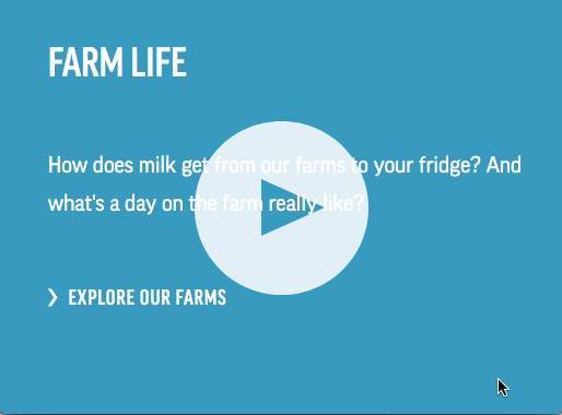
Our Digital
Experience

To continuously ensure the best user experience and representation of our brand, our digital expression of DFA will always be evolving. To help you make the best choices for our web and social media experiences, it’s important to understand the thinking behind how we use our core brand elements on these platforms.

Our Brand Online

When translating the DFA brand into the digital space, accessibility should always be top of mind. This practice ensures there are no barriers that prevent interaction (or access to) our websites by people with physical disabilities, situational disabilities and socio-economic restrictions that may impact bandwidth and speed. This means that some elements have shifted to align with ADA compliances so that legibility is guaranteed for all audiences.

Color contrast

The contrast ratio between a color and its background ranges from 1-21 based on its luminance, or intensity of light emitted, according to the World Wide Web Consortium (W3C) who created WCAG 2.0.

Contrast ratios represent how different a color is from another color, commonly written as 1:1 or 21:1. The higher the difference between the two numbers in the ratio, the greater the difference in relative luminance between the colors.

In addition to basic text, here are just some of the other elements that should be considered when it comes to ensuring color contrast ratios are accessible:

• Interactive elements (anything a mouse can click on such as buttons, links, etc.)
• Hover state color changes
• Form fields (placeholder text, input field color and outline, error states active states, etc.)
• Informational elements (non decorative icons, illustrations, etc.)
• Structural elements that aid in readability (bullet points, divider bars, etc.)
• Images of text (be careful with backgrounds of varying colors)

To ensure your design choices are ADA compliant, please check your work with the link below.

Digital Blueclick to expand
Digital Blue is our web-friendly version of Visionary Blue, ensuring ADA compliance for readability and contrast. Digital Blue should replace Visionary Blue in all digital applications, including our website, digital ads, email and social content. In non-digital applications use Visionary Blue, never Digital Blue.
rgb
r: 25 g: 146 b: 194

hex
#1A92c2
FOR COMPARISON: Visionary Blue
American Navyclick to expand
As the cornerstone of our brand, American Navy represents our commitment to farmers across the country. The strong sophistication communicates a steadfast, professional and trustworthy organization.
rgb
r: 0 g: 47 b: 108

hex
#002f6c
Barn Redclick to expand
As a cooperative of dairy farmers, it seems natural that a red reflective of our iconic barns would be part of our brand. While those buildings are commonplace on farms, this color is typically reserved for our primary logo or small accents.
rgb
r: 137 g: 34 b: 53

hex
#9d2235

Grazing Green

HTML/HEX
78BE21

RGB
R: 120 G: 190 B: 33

Sunset Orange

HTML/HEX
F47E28

RGB
R: 245 G: 127 B: 41

Butter Yellow

HTML/HEX
F6BE00

RGB
R: 246 G: 190 B: 0

Tractor Red

HTML/HEX
DA291C

RGB
R: 218 G: 41 B:28

Milk White

HTML/HEX
FFFFFF

RGB
R: 255 G: 255 B: 255

Subtle Silver

HTML/HEX
D9D9D9

RGB
R: 217 G: 217 B: 217

Slate Gray

HTML/HEX
262626

RGB
R: 38 G: 38 B: 28

Midnight Black

HTML/HEX
000000

RGB
R: 0 G: 0 B: 0

Alternative text

While not a design-specific requirement, and more for content strategists to define, and developers to implement, it’s something important to be aware of.

Users with low vision often make use of Screen Readers to “read” the web. These specialized tools convert text to speech so that a user can hear the words on a site. When a screen reader lands on an image, it looks for alt text in the code that it can read aloud – if it finds nothing, it will often just say “image,” leaving the user in the dark as to what the image is and how it matters.

Ensure that you’re describing, in text, what the image is communicating. A good rule to consider is to include what you might relay over the phone.

To be compliant, WCAG 2.0 states that descriptive alternative text must be included for all non decorative images (anything there for just looks). This includes images of text, button images, icon images, etc. The alternative text must clearly describe the image.

Do this

A milk truck arrives at the Dairy Farmers of America dairy processing plant in Fallon, Nevada

Don’t Do This

Milk truck

Focus and Hover states

Focus and hover styles help users navigate and identify where they are and what’s interactive. While a default visual focus indicator is provided by web browsers, some designers ask developers to actively hide these styles for one reason of another. This should never be done.

What’s important to know is that keyboard users use the tab key to navigate to each interactive element on a page, and the only way that they know where they are is this focus state (indicated as an outlined border around the focused element. This isn’t a hover state).


Hover States

It’s important to include more than a color change as discussed previously – a good rule of thumb is two states of change (color + something else). As with focus states, it’s also important that hover states be easily viewable, and meet color contrast rules.

Focus States

If designers don’t prefer the web browser’s default focus state, they should design another option that’s accessible and matches well to the design of the website. It’s important that focus states be easily viewable, and meet color contrast rules. It’s also appropriate to use the mouse hover state for the keyboard focus state if it’s accessible and can be clearly seen.

To be compliant, WCAG 2.0 states that users need to find their way around your website in a sequential and meaningful order. If they use a keyboard to navigate the website, they should be able to see which element they are on at any time (a focus state).

Writing for the web

Website Writing

Especially on our websites, direct and concise are more important than clever and flowery. When users visit a website, they’re looking for something specific – usually quickly skimming each paragraph. It’s our job to make it easy for them to find exactly that they’re looking for.

Here are a few quick tips:

  • Use lists like this when you have three or more quick nuggets of information you’d like to share
  • Break long paragraphs into shorter, skimmable snippets. A one-sentence copy block can powerfully call out important information
  • Include clear, explicit calls to action (CTA) to guide users on an intentional journey
  • Put the most important information at the top of the page, followed by supporting storytelling

UI Overview

UI, or User Interface, is the design of a digital environment that enhances the interaction between user and information. As with all DFA communications, our work in this space is defined by guiding elements:

© 2025 Dairy Farmers of America, Inc.  Privacy Policy | Terms of Use | California Supply Chains Act