Our
Typography

Typography is defined as the art and technique of arranging type to make written language legible, readable and appealing when displayed. For DFA, it also means adhering to a font and styling systems that unify our look and enables users to identify our brand.
Our Primary Typeface

Good Pro

ABCDEFGHIJKLMNOPQRSTUVWXYZ
abcdefghijklmnopqrstuvwxyz
0123456789

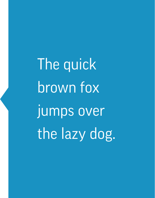
Our primary font, Good Pro, is a sans serif font used for a large portion of DFA communications. The multiple weights, solid spacing and clear legibility of Good Pro ensures that our messages are coherent and distinct. While all weights and widths are acceptable, the rules below ensure that we use our typography in a way that matches our tone and enhances our voice.

Headlines and Subheads

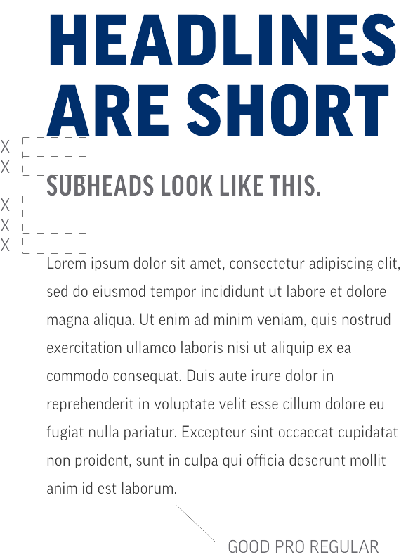
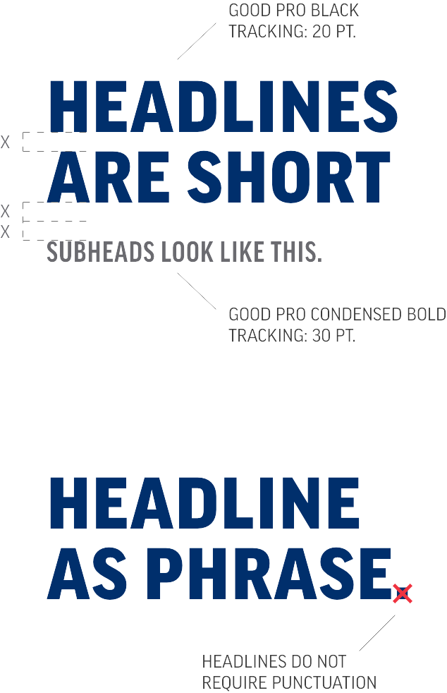
Headlines should be set in all caps Good Pro Black and default to a short phrase whenever possible to maintain impact of this treatment.

Ideally all headlines and subheads should adhere to our primary color palette with the exception of Barn Red.

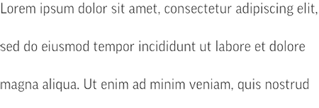
Leading, or the space between two lines of text, should be set tighter than the default setting but not so tight as to hinder legibility.

Subheads should be set in all caps Good Pro Condensed Bold beneath headlines with a space measuring twice the leading height of a two-line headline.

Headlines should be treated as phrases and therefore do not require a period. Subheads are treated as full sentences, adding clarity to headlines and should include a period. For additional details, please reference our Written Style Guide available in the DFA Asset Library.

Body copy

Body copy should ideally be set left justified in Good Pro Regular in Slate Gray (85% Black).

Body copy always should be set in sentence case.

Should the background shift, Milk White and American Navy are acceptable substitutions.

Body copy should be placed beneath subheads with a distance matching three times the leading of headlines.

Leading should be set using our 20/20/20 rule by which point size, leading and tracking are the same setting.

While there are no rules for scale, body copy should always be set to a point size that complements headlines and subheads.

DO NOT change headlines from all caps

DO NOT overextend the leading

DO NOT add punctuation to headlines

DO NOT Use Visionary blue on body copy

DO NOT use headlines longer than 7 words.

DO NOT Justify body copy

Our Secondary Typeface

Miller
Display

ABCDEFGHIJKLMNOPQRSTUVWXYZ
abcdefghijklmnopqrstuvwxyz
0123456789

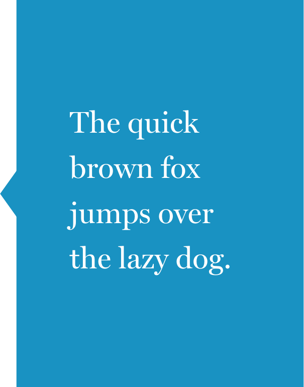
Our secondary font, Miller Display, is a serif font that is used for more emotive, personal content. The approachable nature of Miller imparts a personality closely connected with the experience of dairy, an integral part of our brand. Usage is primarily reserved for use in Half & Half and formal event communications and tends to be oversized in nature. 

© 2025 Dairy Farmers of America, Inc.  Privacy Policy | Terms of Use | California Supply Chains Act